Cumulative Layout Shift: What CLS Is and How to Fix It
AI Summary
What is Cumulative Layout Shift? Cumulative Layout Shift, or CLS, is the Core Web Vital that measures visual stability. It quantifies how much the visible content of a page moves around unexpectedly while it loads and while a user interacts with it. A low CLS score means the page stays still. A high score means elements are jumping around, pushing content out of position, and causing the kind of experience where you tap one thing and hit another because everything shifted at the last moment.
What it is and who it is for: This guide covers what CLS measures, how the score is calculated, the specific causes of layout shift, how to test your CLS score, how to fix every common cause on any platform including WordPress, how CLS behaves differently on mobile, and how it affects rankings. It is for site owners, developers, and SEO practitioners who need to understand why pages shift and how to stop it.
The rule: The fix for almost every CLS problem is the same principle: reserve the space before the content arrives. Images need dimensions. Ads need containers. Fonts need fallback matching. Dynamic content needs to insert below existing content, not above it. The pages that pass CLS are the ones that tell the browser what to expect before it happens.
What CLS Measures
Cumulative Layout Shift measures how much the visible elements of a page move from their initial position during loading and throughout the user’s session. Everyone has lived through bad CLS. You open an article, start reading, and the text suddenly jumps down because an ad loaded above it. Or you go to tap a button and an image finishes loading, pushes everything down, and you tap the wrong link. That involuntary movement is layout shift, and CLS quantifies it.
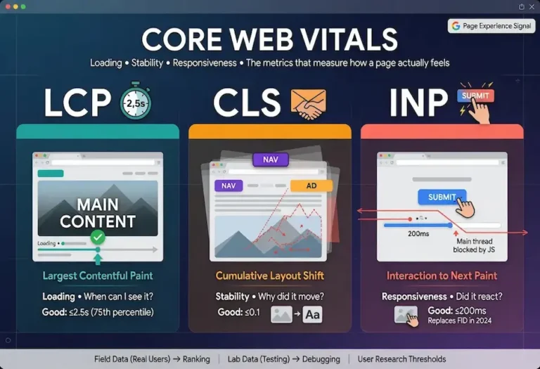
What makes CLS distinct from the other Core Web Vitals is that it does not measure speed. Largest Contentful Paint and Interaction to Next Paint are both about time. CLS is about stability. A page can load fast and still score terribly on CLS if the elements that load are constantly repositioning each other. The metric captures the difference between a page that assembles itself cleanly and one that lurches into place piece by piece.
Google included CLS as one of the three vitals because instability is a genuine usability problem, not a cosmetic one. Layout shift causes mistaken taps, lost reading position, and the general sense that a page is broken or untrustworthy. On a transactional page it causes real errors, like clicking the wrong product or the wrong button during checkout. Stability is part of whether a page feels reliable, and reliability is part of the experience that Google’s ranking systems evaluate.
The CLS Threshold and How It Is Scored
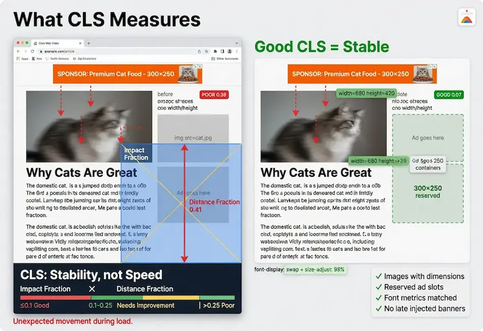
Google’s threshold for good CLS is a score of 0.1 or less. Between 0.1 and 0.25 needs improvement. Above 0.25 is poor. Unlike the other vitals, CLS is not measured in time units. It is a unitless score derived from two factors multiplied together: the impact fraction and the distance fraction.
The impact fraction measures how much of the viewport the shifting elements affected. If a text block covers 40% of the viewport and it shifts, the impact fraction is 0.4. The distance fraction measures how far those elements moved relative to the viewport height. If that text block moved 10% of the viewport height, the distance fraction is 0.1. The layout shift score for that single event is 0.4 multiplied by 0.1, which equals 0.04. That is one shift event. CLS accumulates these across the page session.
The practical takeaway from that formula is that big elements moving far is what kills your score. A tiny icon nudging two pixels barely registers. A large content block jumping a third of the way down the screen scores heavily. Understanding the math helps prioritize fixes: start with the largest elements that move the farthest, because those contribute the most to the cumulative score.
One important nuance Google built in: layout shifts that happen within 500 milliseconds of a user interaction are excluded from the score. If a user clicks a button and content expands as a result, that is expected movement, not unexpected shift, so it does not count. CLS only penalizes movement the user did not cause. This is why a well-built accordion or expanding menu does not hurt your score, while content that jumps on its own during load does.
How Google Calculates CLS: Session Windows
The way Google calculates the final CLS score changed in 2021, and the change matters for how you interpret your results. The original calculation simply summed every layout shift across the entire page lifespan. This punished long-lived pages unfairly, because a page that stayed open for ten minutes accumulated more shift events than one closed after thirty seconds, even if the moment-to-moment stability was identical.
The current calculation uses session windows. Google groups layout shift events into windows of no more than 5 seconds, with no more than 1 second between consecutive shifts within a window. The CLS score reported is the largest single session window, not the sum of all shifts across the entire session. This means a page that has one rough moment during load but then stays perfectly stable for the rest of the visit is scored on that one rough moment, not on the cumulative total of every minor adjustment over the full session.
This matters for diagnosis. If your CLS score is bad, the problem is concentrated in one burst of instability, not spread across the entire page. Finding and fixing that one burst, which is usually during initial load when images, ads, and fonts are arriving, fixes the entire score. The session window approach makes CLS more forgiving for pages that stabilize quickly and more actionable for developers because the fix is localized rather than dispersed.
What Causes Layout Shift
Images and Video Without Dimensions
Images without width and height attributes are the most common cause of layout shift. When an image tag has no dimensions, the browser does not know how much space to reserve. It collapses the space to zero, renders the surrounding content, then shoves everything aside when the image arrives. The fix is the same advice from twenty years ago: put width and height on your images. The modern CSS equivalent is using the aspect-ratio property, which reserves the correct proportional space regardless of the rendered size.
Video elements and iframes cause the same problem for the same reason. An embedded YouTube video without a declared aspect ratio reserves no space until the iframe loads, then forces everything below it to jump. Responsive video containers using padding-top hacks or the aspect-ratio property solve this by reserving the correct vertical space at every viewport width.
Ads, Embeds, and Iframes
Ads are the second major source. They load asynchronously and often from third parties, and they frequently inject themselves into the layout after the surrounding content has rendered. An ad slot that has no reserved space will push content down the moment the ad fills it. Embedded social media widgets, newsletter signup forms, and third-party iframes do the same thing when their dimensions are not declared in advance. The challenge with ads is that the creative dimensions can vary, which makes reserving exact space harder than it is for images you control.
Web Fonts
Web fonts cause a subtler form of shift. When a custom font loads, the text re-renders in the new font, and if that font has different metrics (character width, line height, ascender and descender proportions) than the fallback, the text reflows and shifts. This is the flash of unstyled text problem, and it produces layout shift as the text resizes. The shift is usually small per element but multiplied across many text blocks on a content-heavy page, it adds up.
Dynamically Injected Content
JavaScript that inserts elements above existing content after the page has rendered is the fourth source. Cookie consent banners, notification bars, promotional strips, and any content that pushes everything below it down contributes to CLS. The damage is often severe because these injections typically happen at the top of the page and shift the entire viewport worth of content. A cookie banner that pushes the page down by 60 pixels shifts everything the user was already reading.
Late-Loading Navigation and Headers
Headers that load differently depending on login state, personalized navigation bars, and menus that resize after JavaScript initializes can all shift content below them. If the header renders at one height, then JavaScript changes it to a different height, everything below shifts. This cause is less common than images and ads but harder to diagnose because it happens fast and early, often before the developer notices it during manual testing.
How to Test CLS
CLS is the trickiest Core Web Vital to test accurately because it depends on user behavior, viewport size, and the specific sequence of resource loading. A lab test that loads the page in ideal conditions may show a perfect score while real users on slower connections see significant shift because resources arrive at different times.
Field Data Tools
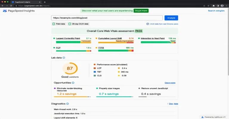
The Core Web Vitals report in Google Search Console shows your CLS field data from real Chrome users. This is the score Google uses for ranking and the most reliable indicator of your actual CLS performance. PageSpeed Insights shows the same CrUX field data at the page level when enough traffic exists to generate a report.
Lab Data Tools
Lighthouse (via PageSpeed Insights or Chrome DevTools) measures CLS during a simulated page load. The lab CLS score only captures shifts during the initial load, not shifts from user interaction or lazy-loaded content that appears on scroll. This means lab CLS can be significantly lower than field CLS if your page has shift-causing elements that load below the fold or after user interaction.
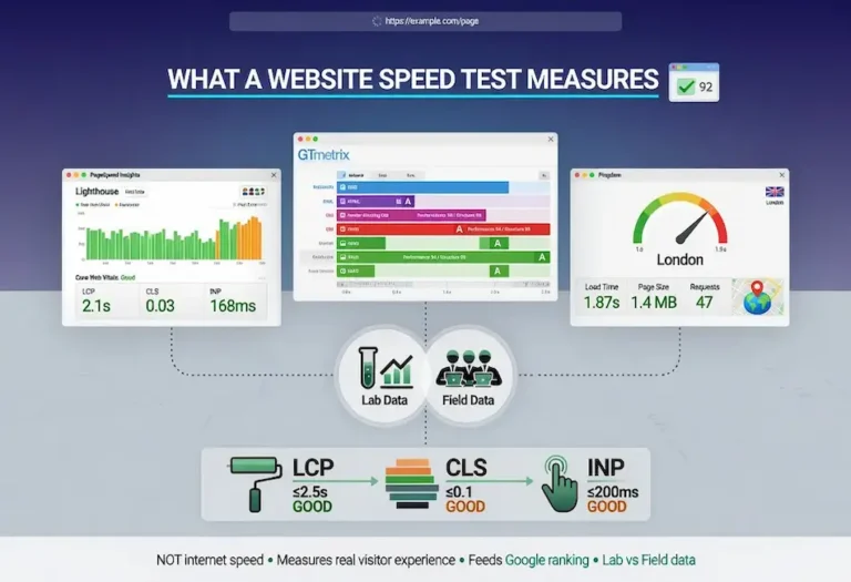
GTmetrix runs Lighthouse and provides the same lab CLS measurement with the addition of historical tracking, so you can see whether your CLS has improved or degraded over time. Pingdom does not report CLS directly, but its waterfall can reveal the timing of resource loads that cause shifts.
The Layout Shift Debugger in Chrome DevTools
The most precise diagnostic tool is Chrome DevTools Performance panel. Record a page load, and the panel highlights every layout shift event with a visual indicator showing which elements moved and how far. This is the tool that connects the CLS score to the specific element causing the problem. Once you identify the shifting element, you can trace it back to the cause: a missing dimension, a late-loading resource, or a dynamically injected block.
For ongoing monitoring, the web-vitals JavaScript library logs CLS from real users into your analytics platform, giving you field data independent of CrUX with faster feedback than the 28-day rolling window.
How to Fix Cumulative Layout Shift
The unifying principle behind every CLS fix is the same: tell the browser what to expect before it happens. Reserve the space for elements that load asynchronously. Declare dimensions for media. Match fallback fonts to custom fonts. Insert dynamic content below existing content, not above it. Every fix is a variation on that principle.
Fix Images and Video
Always include width and height attributes on image and video elements, or use the CSS aspect-ratio property. When the browser knows the dimensions, it reserves the correct space immediately and nothing shifts when the media arrives. This single fix resolves the majority of CLS problems on most sites. For responsive images using srcset, the width and height attributes still belong on the img tag. The browser uses them to calculate the aspect ratio and reserves proportional space at every viewport width.
Fix Ads and Embeds
Reserve the space with a container of fixed dimensions sized to match what will load. If you run an ad slot that serves a 300 by 250 unit, give it a container of exactly that size so the space exists before the ad fills it. The space sits empty for a moment, which is a far better experience than the content jumping when the ad arrives. For responsive ad units that vary in size, reserve space for the most common dimension to minimize the shift. If the ad is smaller than the container, the extra space is invisible. If it is larger, the small overflow shift is better than reserving nothing.
Fix Web Fonts
Match the fallback font metrics to the custom font as closely as possible using the CSS size-adjust, ascent-override, descent-override, and line-gap-override descriptors in the @font-face rule. These let you tune the fallback font’s dimensions to match the custom font, so when the swap happens, the text occupies the same space and nothing reflows. Preloading the primary font files also helps by getting them to the browser earlier, reducing the window in which fallback text is visible. Use font-display: swap to ensure text is visible immediately in the fallback font rather than invisible until the custom font arrives.
Fix Dynamic Content Injection
Avoid inserting elements above existing content unless it is in direct response to a user interaction. If you must show a banner or notification, reserve space for it in the initial layout with a placeholder of the correct height, or use CSS position: fixed or position: sticky to overlay rather than displace content. Cookie consent banners should overlay the bottom of the viewport, not push the top of the page down.
Fix Header and Navigation Shifts
Set a fixed min-height on the header element that matches its fully loaded height. If the header changes based on login state or JavaScript initialization, ensure the initial CSS-only render already occupies the same space the JavaScript-enhanced version will occupy. The goal is zero height change between the initial render and the final state.
The complete priority sequence for all speed fixes, including CLS, is covered in the page speed optimization guide.
CLS on WordPress
WordPress sites have specific CLS patterns that come from the CMS ecosystem. The most common WordPress CLS issue is images without width and height attributes. WordPress has added these attributes automatically since version 5.5 for images inserted through the media library, but images added through custom fields, page builder widgets, or hardcoded in theme templates may not get them automatically. An audit of the rendered HTML, not the editor view, reveals which images are missing dimensions.
Theme-Caused CLS
Themes that load web fonts without proper fallback matching are a frequent CLS source. Premium themes often load multiple font weights and families from Google Fonts, and each swap produces a small shift. Lightweight themes like Kadence that use system font stacks or load minimal custom fonts produce less CLS by default. If your theme loads fonts, check the @font-face declarations for font-display and size-adjust settings.
Plugin-Caused CLS
Plugins that inject content into the page after load are CLS contributors. Cookie consent plugins, notification bar plugins, popup plugins, and floating action button plugins all insert DOM elements after the initial render. Each one has the potential to shift content. The fix is either configuring the plugin to use fixed or sticky positioning (overlay instead of displace) or reserving space for the injected element in the theme’s CSS.
Page Builder CLS
Page builders can generate CLS through lazy-loaded sections, background images without dimensions, and JavaScript-driven layout calculations that change element positions after the initial CSS render. The Elementor and Divi editors both have options for setting minimum heights on sections, which functions as space reservation. Using those settings on above-the-fold sections prevents the layout from shifting as builder JavaScript initializes.
A lean WordPress setup using Kadence with proper image dimensions, minimal font loading, and no above-the-fold dynamic content injection will pass CLS without any specialized optimization. The problems start when layers of plugins and builder complexity are stacked on top without attention to their CLS cost.
CLS on Mobile vs Desktop
CLS typically scores worse on mobile than on desktop, and Google evaluates mobile CLS separately in its ranking assessment. The reasons are mechanical. Mobile viewports are narrower, so the same element shift covers a larger fraction of the viewport. An image that shifts 50 pixels occupies 5% of a 1000-pixel desktop viewport but 13% of a 390-pixel mobile viewport. The same absolute shift produces a higher CLS score on mobile because the impact fraction is larger relative to the viewport.
Mobile also loads resources differently. Slower connections mean resources arrive at more varied intervals, increasing the window during which shift events can occur. A page that loads all its images within 200 milliseconds on a fast desktop connection might spread those loads over 2 seconds on a mobile network, creating more opportunities for sequential shifts as each image arrives and pushes content around.
Responsive ad units create a specific mobile CLS problem. Ad networks serve different creative sizes to mobile viewports, and the size that fills the slot may not match the space reserved for it, if any space was reserved at all. Mobile ad slots that collapse to zero height when no ad is available and then expand when an ad loads are one of the most persistent CLS problems on ad-supported sites.
Test CLS on mobile separately from desktop. The Chrome DevTools device simulation lets you test with a mobile viewport and throttled connection. The Search Console Core Web Vitals report separates mobile and desktop scores, so you can identify whether a CLS problem is mobile-specific. A page that passes CLS on desktop but fails on mobile needs mobile-specific fixes, usually tighter dimension declarations and mobile-specific minimum heights on containers.
CLS and Advertising
Advertising is the most difficult CLS challenge because the site owner does not control the creative dimensions, load timing, or rendering behavior of the ads. The ad network decides what to serve, and the site absorbs the CLS consequence. This tension between revenue and user experience is real, and pretending it does not exist does not help anyone fix it.
The practical fixes work within that constraint. Reserve space for every ad slot using a container with a min-height matching the most common creative size for that position. If the ad is a 300 by 250 unit, the container is 250 pixels tall. If a smaller creative loads, the extra space is barely noticeable. If no ad loads, the empty container creates a small visual gap that is vastly preferable to content jumping.
For sticky or anchor ads that appear at the top or bottom of the viewport, use CSS position: fixed or sticky so the ad overlays the content rather than displacing it. These ad formats produce zero CLS because they do not move any other elements. The shift happens only when the ad inserts itself into the document flow, and fixed or sticky positioning keeps it out of the flow entirely.
Lazy-loading ads that appear below the fold reduces CLS impact because shifts that happen outside the viewport at the moment they occur do not count toward the score. If the user has scrolled past the point where the ad loads, the shift was never visible to them and is excluded from the CLS calculation. This is why below-the-fold ad slots cause less CLS damage than above-the-fold slots, even with identical creative dimensions and load behavior.
For sites where ad revenue is significant, the tradeoff is direct. Every CLS improvement for ads requires either reserving space (which may display empty containers when ads fail to load) or limiting ad positions to below-the-fold and overlay formats (which may reduce ad visibility and revenue). The best approach is measuring both: track CLS in Search Console alongside ad revenue, and find the configuration where CLS passes without meaningfully reducing revenue. That configuration exists on nearly every site. It just requires testing rather than guessing.
How CLS Affects Rankings
CLS is one of the three Core Web Vitals that feed into Google’s page experience ranking signal. The page experience signal is a tiebreaker, not a primary factor. Content relevance and quality determine most of the ranking. When two pages are closely matched on content signals, the page with better Core Web Vitals, including CLS, can win the higher position.
CLS is often the easiest of the three vitals to fix because the solutions are mechanical rather than architectural. Adding image dimensions, reserving ad space, and fixing font loading do not require rethinking the site’s infrastructure the way LCP server response problems or INP JavaScript optimization might. This makes CLS the vital where the effort-to-improvement ratio is highest. A few hours of dimension and container fixes can move CLS from failing to passing across an entire site.
The indirect ranking effect of CLS is through user behavior. A page where content jumps around frustrates users, increases accidental clicks, and reduces the likelihood of engagement with the actual content. Users who accidentally tap the wrong link, get sent somewhere they did not intend, and bounce back to the search results generate a negative engagement pattern. A stable page keeps users on the intended reading path, which supports the engagement signals that feed back into ranking evaluations.
CLS also affects how crawlability interacts with rendering. Googlebot renders pages to evaluate the full layout, and pages with significant layout shift during rendering can produce inconsistent layout snapshots that affect how Google interprets the content structure. A stable page renders predictably every time, which means Google’s rendering of the page matches what users see. Consistency between the rendered layout and the user experience supports the on-page signals that contribute to ranking.
The website speed test guide maps how CLS testing fits into the complete speed testing workflow alongside LCP and INP measurement. For the broader context of how page experience connects to the complete SEO discipline, including internal linking, content quality, and E-E-A-T signals, the technical foundation that Core Web Vitals represent is one layer of a system where every component reinforces the others.
FAQ
What is Cumulative Layout Shift?
Cumulative Layout Shift is the Core Web Vital that measures visual stability. It quantifies how much the visible content of a page moves around unexpectedly during loading and user interaction. The score is unitless and calculated from how much of the viewport shifted and how far it moved. Google’s threshold for a good CLS score is 0.1 or less.
How do I fix Cumulative Layout Shift?
The core fix is reserving space for elements before they load. Add width and height attributes to all images and videos. Wrap ad slots and embeds in containers with fixed dimensions matching the expected content size. Match fallback font metrics to custom fonts using CSS size-adjust descriptors. Avoid inserting content above existing elements after the page has rendered. These four fixes resolve the vast majority of CLS problems.
What causes high CLS scores?
The most common causes are images without width and height attributes, ad slots without reserved space, web fonts that reflow text when they swap in, and JavaScript that injects content above existing elements after the page has loaded. Each of these causes elements to move from their initial position, which the browser reports as layout shift events that accumulate into the CLS score.
How do I test CLS on my website?
Start with the Core Web Vitals report in Google Search Console for field data from real users. Run individual pages through PageSpeed Insights to see both field and lab CLS scores. Use Chrome DevTools Performance panel to identify exactly which elements are shifting and by how much. Test mobile and desktop separately because CLS typically scores worse on mobile due to narrower viewports.
Does CLS affect SEO rankings?
Yes. CLS is one of the three Core Web Vitals that feed into Google’s page experience ranking signal. The signal functions as a tiebreaker rather than a primary factor. Content relevance determines most of the ranking, but when pages are closely matched on content quality, the page with better CLS can win the higher position. CLS is often the easiest of the three vitals to fix because the solutions are mechanical rather than architectural.
How do I fix CLS on WordPress?
Ensure all images have width and height attributes in the rendered HTML, not just in the editor. Use a lightweight theme that loads minimal custom fonts. Configure cookie consent and notification plugins to use fixed or sticky positioning rather than pushing content down. Set minimum heights on above-the-fold page builder sections. Audit plugins that inject DOM elements after load and either configure them to overlay or remove them if their function does not justify the CLS cost.
What is a good CLS score?
Google defines good CLS as 0.1 or less, measured at the 75th percentile of real user page loads. Between 0.1 and 0.25 needs improvement. Above 0.25 is poor. A score of 0 is achievable and means no unexpected layout shift occurred at all. Most content pages can reach a score under 0.05 with proper image dimensions and no above-the-fold dynamic content injection.
Why is my CLS worse on mobile than desktop?
Mobile viewports are narrower, so the same absolute element shift covers a larger fraction of the screen, producing a higher CLS score. Mobile connections are also slower, which spreads resource loading over a longer window and creates more opportunities for sequential shifts. Responsive ad units that serve different creative sizes on mobile add another variable. Test and fix CLS on mobile separately from desktop, using mobile-specific dimension declarations and container heights.